Rebuilt Website and User Experience Using Paylocity’s New Brand and Messaging, and In-Depth User-Focused Research.
Paylocity, a market leader in cloud-based payroll and human capital management, wanted to construct a completely new website to highlight their branding and address recurring usability difficulties. To do this, we began with research and a complete web building process based on data. This includes a comprehensive SEO transfer as well as a Google Analytics migration for the new site.
The Challenge
Paylocity collaborated with Digizen International to totally redesign their website to display their branding, as well as to create a website with an engaging, intuitive, and easy user experience. The major stakeholders’ message regarding the user experience was clear: the site was:
- Hard to navigate
- Difficult to update
- Slow to load
- Doesn’t work as expected
- Doesn’t match the brand
- Doesn’t engage the customer
- Lacking in mobile engagement
To address these issues, the Digizen International UX and web development teams would collaborate closely with multiple key stakeholders to address multiple website issues, create a rethought information architecture translated into wireframes, and collaborate with a partner design agency to bring it all to life.
To address these issues, the Digizen International UX and web development teams would collaborate closely with multiple key stakeholders to address multiple website issues, create a rethought information architecture translated into wireframes, and collaborate with a partner design agency to bring it all to life.
Paylocity intended to keep as much of their present organic exposure, traffic, and rankings as possible following the redesign, in addition to the design and usability of the website. This would necessitate a comprehensive SEO migration to ensure that all search engine traffic and visibility would be preserved or increased following the launch.
What is the most difficult task? All of this would have to be done on a tight timetable, with a huge number of stakeholders, and with numerous moving components to ensure an efficient, successful launch.
The Analysis
To begin, the Digizen International UX and web development teams met on a regular basis with key stakeholders at Paylocity. These sessions focused on gathering feedback and insights for UX and design research, strategy development, continuing task check-ins, and task and design finalisation / approval. The aim for Digizen International was to become an integrated member of the Paylocity team, see the vision of the new website, and grasp what success would look like for the team in the end.
Speak to the Rebrand
Paylocity’s first aim was to better highlight the branding. This implies that logos, colours, layouts, fonts, and other elements on the website would have to alter to comply with the new branding rules.
Old Logo
NewLogo
We collaborated closely with Paylocity’s marketing and branding teams to ensure that the new branding requirements were transferred to the new Paylocity website. We then presented drawings to stakeholders for approval before proceeding with design work and development.
Focus on User Experience
On the former Paylocity website, key stakeholders were aiming to ease a number of pain issues. Our UX specialists conducted research on the website’s user flows and analysed heatmaps using Hotjar. With Hotjar, we concentrated on:
- Heatmaps: Where users were moving their cursors on the site
- Clickmaps: Where users were clicking when on the site
- Scrollmaps: How far users were scrolling down the webpage
- User Videos: Videos of real users visiting the website
- Surveys: Asking users for direct feedback about the website and pages they are on.
This data helped us understand how visitors interacted with the website and how we might better prioritise information and calls to action on the site.
Maintain SEO Visibility
Our SEO professionals went to work behind the scenes, doing extensive technical, content, and off-page SEO audits to gather the data we needed to assure a smooth migration.
Our aims were to identify the most valuable SEO content and pages on the Paylocity website and ensure they were correctly moved or 301 redirected to the new website.
In our analysis, we used tools like:
- Google Analytics
- Majestic
- Search Console
- Moz Link Explorer
- SEMRush
These tools would provide us with information on the sites that received the greatest search engine traffic, conversions, keyword ranks, backlinks, and general engagement. They would also point out critical content gaps on the Paylocity site, allowing us to generate new material and grab additional qualified search engine traffic and conversions from queries for which Paylocity was not previously appearing.
Keep the Data Clear
All of this effort would result in both a Google Analytics audit and a Google Analytics migration. Our Google Analytics team began by examining the present Paylocity Google 360 setup to see whether data was being captured and reported correctly. Following that, our GA specialists collaborated with the usability, design, and digital marketing teams to track key conversions and events across the website so that Paylocity could correctly assess performance.
The Solution
After the study was completed, our teams set to work, cross-collaborating to guarantee that information architecture, content, design, development, and analytics brought Paylocity’s fresh new website to life. We divided our efforts into four categories.
Data-Driven Information Architecture
Our UX specialists started optimising the website’s user flow by categorising information and pages into prioritised navigation elements, inspired by Google Analytics data and continuous talks with key stakeholders. We divided the navigation into:
- Who We Serve – Content geared toward the target personas and business sizes Paylocity works with
- Our Products – The products that Paylocity offers to help streamline the target personas and businesses processes
- Resources – Training resources and courses available to target personas to get the most out of Paylocity’s products
- Who We Are – Information about Paylocity and the team behind it
Careers – Information about open positions at Paylocity.
We prioritised material even more under each of these areas by offering more particular bits of content to satiate people going across the site, as well as capitalising queries and keywords in search engines. We began working on the designs after determining how the website will be structured out in terms of user flow and information architecture.
Brand Focused Designs
We started working on the designs once we finished the wireframes and the new information architecture for the Paylocity website. While Digizen International team did not produce the designs, we did construct the wireframes for the design agency to guarantee the site was mobile-friendly and easy to navigate.
We were in frequent contact with the branding and design teams, and we enlisted the help of Paylocity stakeholders as needed for design approval. Our designs were focused on three areas:
- Meet the branding requirements for key stakeholders
- Keep it simple, from user flows to calls to action
- Make it mobile-friendly
To satisfy the aforementioned success criteria, our digital marketing, UX, and web development teams examined designs, sending required adjustments back to design teams or forwarding to Paylocity stakeholders for assessment and approval. We would then begin coding.
Seamless Analytics Migration
As we worked through the Paylocity site’s content architecture and design, our Google Analytics team began assessing Paylocity’s current Google 360 configuration and collaborating with the UX team to determine which GA implementations will be carried over to the new site. The team also began analysing designs as they arrived to see if new products would also require monitoring in GA. Our work in Google 360 includes the following:
- Account setup
- Filtering
- Dashboard creation
- Event and goal tracking
- Ongoing Analytics testing
- Analytics transfer to new website
We effortlessly transitioned the Analytics tracking over to the new site after the Google 360 tracking items were put up, QAing as we went live to ensure everything migrated successfully.
Highly Focused SEO Migration
We cannot overstate the importance of SEO in website migration. Most website migrations that do not prioritise SEO risk losing up to 40% of organic traffic to their site. Those that do so often improve their organic traffic by 15% on average.
Our SEO team, like our Analytics teams, set to work as soon as our analysis began. The SEO team, like our Analytics teams, collaborated with the UX and web development teams to ensure the new Paylocity website was quick, light on code, and mobile-friendly.
Our SEO migration tasks comprised the following:
- Full Content Analysis: SEO scorecarding that was performed to rank pages based on organic value and SEO authority
- Redirect Mapping: Created a full mapping of old URLs to new URLs.
To fulfil these duties, we evaluated the SEO value of each URL on the Paylocity website. This comprises the amount of traffic to that page, the number of backlinks, the number of conversions, and the number of keywords for which it ranks. We would combine this information, assign a score (from 1 to 5, with 5 being the most valuable), and work our way down the list.
Here’s an example:
Paylocity Content Evaluation
We chose how material would be redirected and relocated based on the aforementioned ratings, as well as what information might be updated, condensed, or eliminated to maximise Paylocity’s organic visibility.
The Results
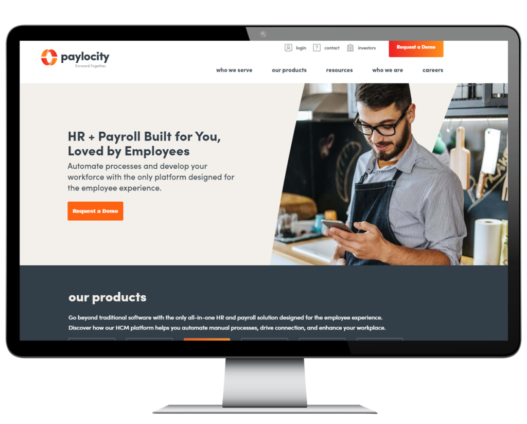
We are quite proud of the product we provided to Paylocity. The new website not only resulted in a nearly 43% boost in organic traffic after launch, but overall engagement improved as a consequence of the new information architecture and user-focused designs.
Old Paylocity Homepage
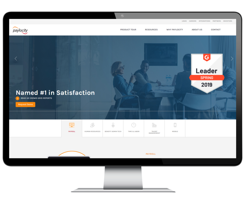
New Paylocity Homepage
Old Paylocity Product Page
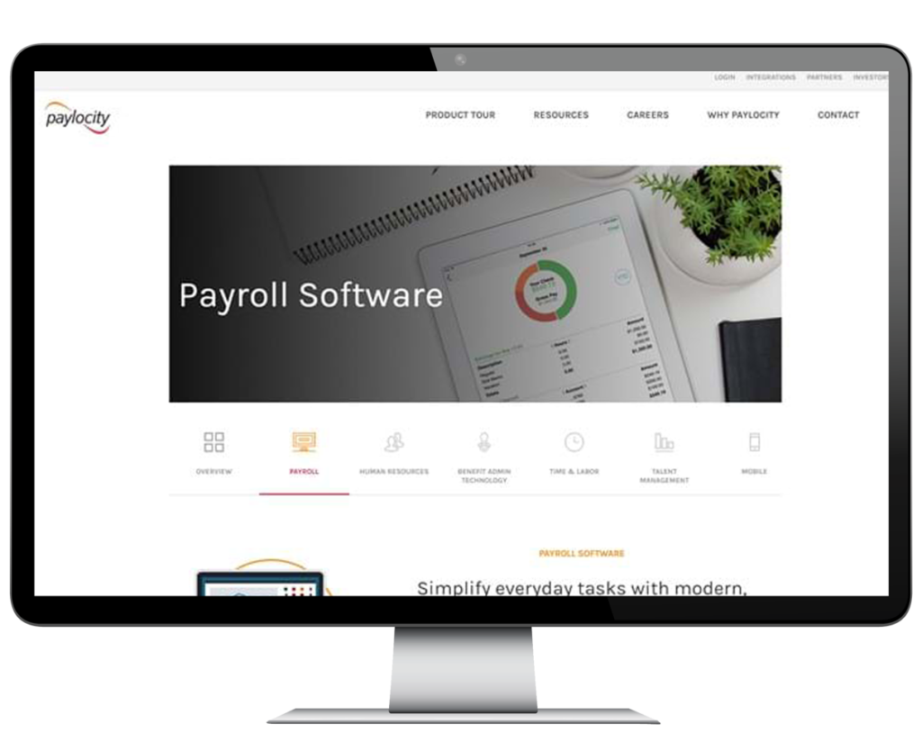
New Paylocity Product Page
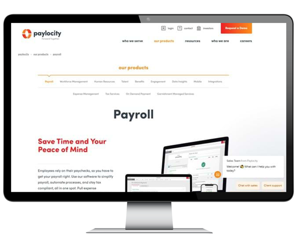
The new designs wonderfully showed the Paylocity redesign, a great credit to the Digizen International, Paylocity, and branding team’s collective efforts. Because each area of the website was designed individually for target customers and industry categories, the new website’s information architecture and usability resulted in increased interaction.
Furthermore, our Google Analytics team painstakingly built Google 360 to cover every traffic and conversion detail, delivering even more insights into site user engagement and conversions, as well as more precise statistics for future decision-making.
We are still seeing gains in organic traffic and engagement three months after launching the redesigned website. Our SEO and Analytics teams continue to engage with and give insights to the Paylocity team on possibilities to increase performance over time.
